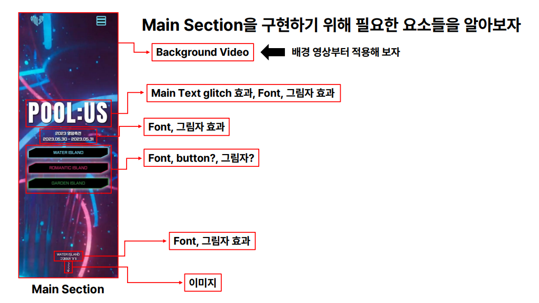
[Clone coding] 성결대 축제사이트 클론코딩 - Main Section
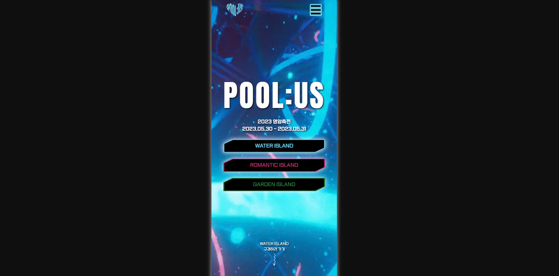
멋쟁이사자처럼 11기 운영진분들이 만든 축제사이트를 클론코딩해보자! 메인 페이지부터 만들어보자.
▶ 레이아웃
레이아웃 구성 전 기본적인 작업을 해보자
- POOL:US 폴더 생성
- index.html, style.css 생성
- Bootstrap 적용
- 기본코드작성
레이아웃을 먼저 잡고 작업하는 것이 매우 중요하다. 아래와 같이 레이아웃을 잡아보자
▶ 필요한 요소 파악하기
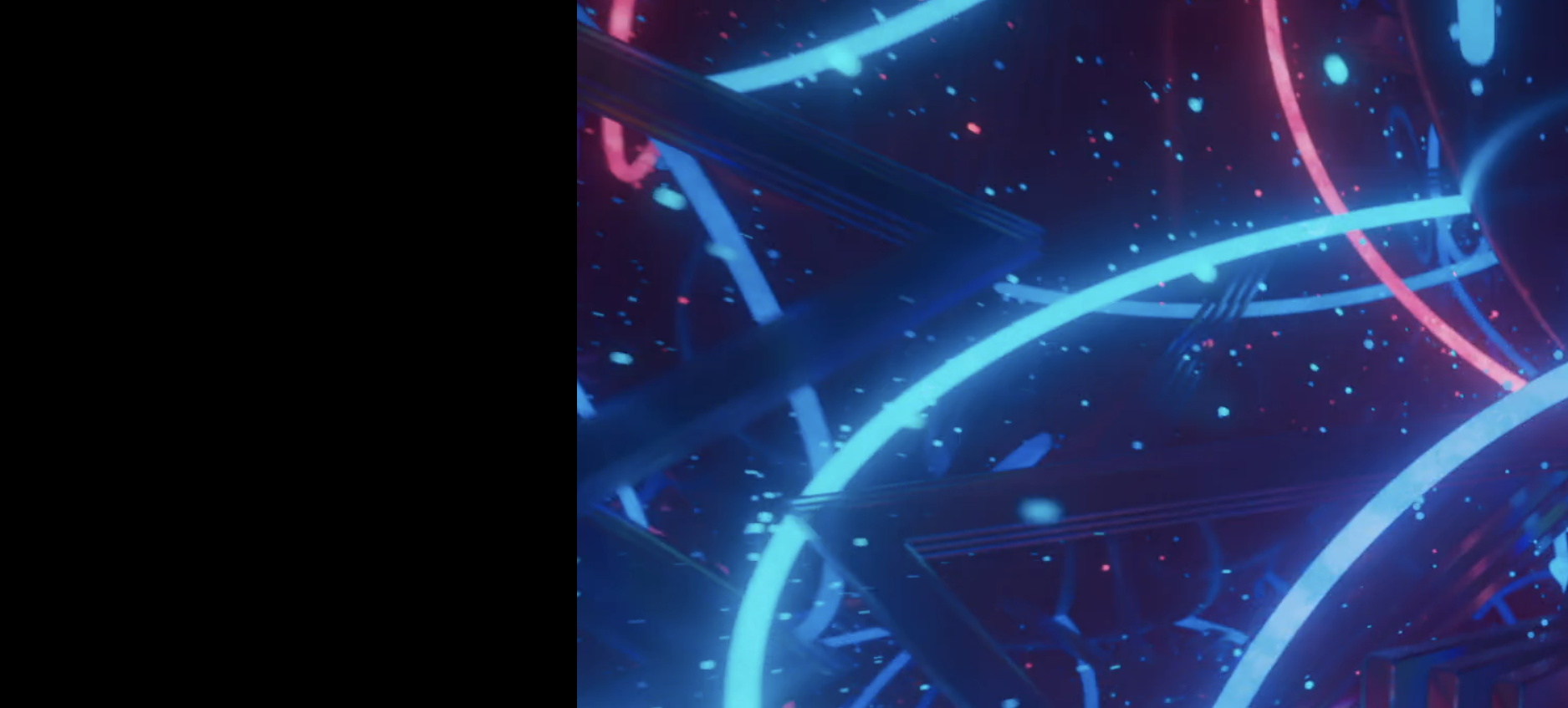
▶ 배경 영상 적용하기
사용한 동영상(출처표기의무x, 상업적 사용 가능): pixabay / Cyberpunk 검색 후 다운로드
미션! 영상 재생시키기
- video태그와 source 태그를사용할 것
- 동영상이 자동재생되게 할 것
- 동영상을 반복재생할 것
- 소리는 필요 없으니 음소거 할 것
- 아이폰(ios)에서도 작동하게 할 것
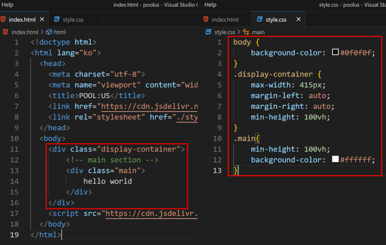
<div class="display-container">
  <div class="main">
    <video autoplay loop muted playsinline>
      <source src="./video/circles_-_53209 (Original).asc" type="video/mp4" />
    </video>
  </div>
</div>
- video태그와 source 태그를사용할 것
- 동영상이 자동재생되게 할 것 ->
autoplay - 동영상을 반복재생할 것 ->
loop - 소리는 필요 없으니 음소거 할 것 ->
muted - 아이폰(ios)에서도 작동하게 할 것 ->
playsinline
미션! 영상을 배경으로
- video 태그에 position을 사용해 왼쪽 상단에 위치를 지정할 것
- 영상이 가로 세로 전체화면(100%)으로 할 것
- 현재 화면 영역을벗어나지 않게 하기(스크롤이 생성되면 안됨)
.main > video {
  position: absolute;
  width: 100%;
  height: 100%;
  top: 0;
  left: 0;
  object-fit: cover;
}
▶ 폰트
웹 폰트는 눈누, Google Fonts를 사용하여 적용한다. Google Fonts중 Anton을 사용하여 폰트를 적용해보자.
@import url("https://fonts.googleapis.com/css2?family=Anton&display=swap");
.anton-font {
  font-family: "Anton", sans-serif;
}
위와같이 웹사이트에서 사용하는 폰트의 종류가 여러 개일 때 폰트를 클래스화 해 놓으면 사용하기 편하다.
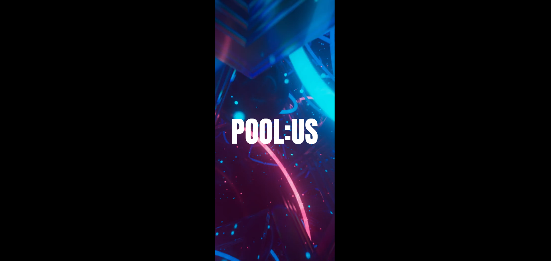
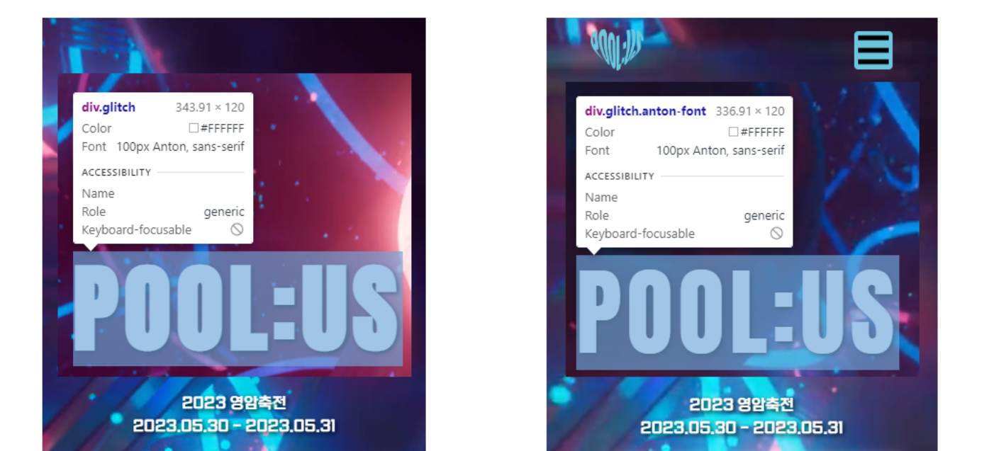
▶ 텍스트 정중앙 배치하기
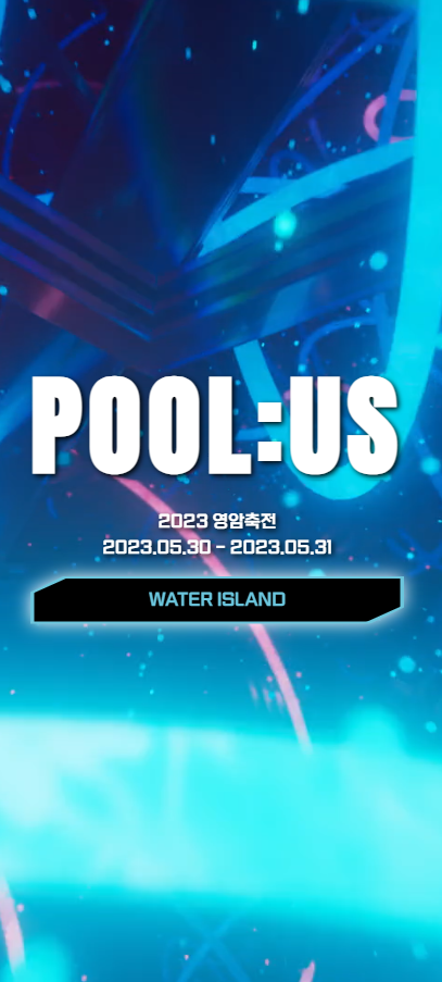
미션! 화면과 같이 텍스트를 배치하자
- 화면에 텍스트를 표시할 것
- 화면의 정 가운데 배치를 할 것(Bootstrap 활용)
- Anton 폰트를 적용할 것
- 폰트 사이즈는 100px로 할 것
<div class="display-container">
  <div class="main d-flex justify-content-center align-items-center">
    <video autoplay loop muted playsinline>
      <source src="./video/circles_-_53209 (Original).asc" type="video/mp4" />
    </video>
    <div class="glitch anton-font">POOL:US</div>
  </div>
</div>
.main {
  position: relative;
  min-height: 100vh;
}
.main > video {
  position: absolute;
  width: 100%;
  height: 100%;
  top: 0;
  left: 0;
  object-fit: cover;
  z-index: -1;
}
.glitch {
  color: #ffffff;
  font-size: 100px;
}
- 화면에 텍스트를 표시할 것
.main > video {
  z-index: -1;
}
z-index 속성은 겹치는 요소의 쌓임 순서를 제어한다.
- 화면의 정 가운데 배치를 할 것(Bootstrap 활용)
<div class="main d-flex justify-content-center align-items-center">
- Anton 폰트를 적용할 것
<div class="glitch anton-font">POOL:US</div>
- 폰트 사이즈는 100px로 할 것
.glitch {
  color: #ffffff;
  font-size: 100px;
}
▶ Glitch 효과 부여하기
정적인 텍스트에 아래와 같이 글리치 효과를 부여하자

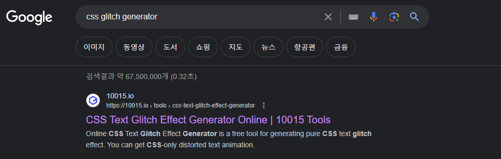
★ “구현하고 싶은 기능 + generator”라고 치면 다양한 기능을 코드를 치지 않고 구현 가능하다!
구글에 아래와 같이 검색해보자: css glitch generator
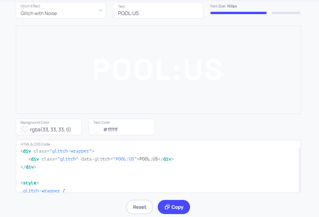
미션! 그림자 효과를 넣어주자

.glitch-wrapper {
  width: 100%;
  height: 100%;
  display: flex;
  align-items: center;
  justify-content: center;
  text-align: center;
  background-color: rgba(33, 33, 33, 0);
  text-shadow: 2px 2px 5px black;
}
text-shadow: 2px 2px 5px black;
▶ 서브 텍스트 배치하기
미션! 화면과 같이 텍스트를 배치하자
- bootstrap을 활용할 것
- Main title과 subtitle이 위 아래로 있을 것(양 옆X)
- 이사만루 폰트를 사용할 것
- 그림자를 적용할 것
- 위아래 마진을 1rem만큼 줄 것

<div class="glitch-wrapper anton-font flex-column">
  <div class="glitch" data-glitch="POOL:US">
    POOL:US
  </div>
  <div class="sub-title issamannu text-white my-3">
    2023 영암축전
    <br />
    2023.05.30 - 2023.05.31
  </div>
</div>
@font-face {
  font-family: "GongGothicMedium";
  src: url("https://cdn.jsdelivr.net/gh/projectnoonnu/noonfonts_20-10@1.0/GongGothicMedium.woff")
    format("woff");
  font-weight: normal;
  font-style: normal;
}
.issamannu {
  font-family: "GongGothicMedium";
}
.sub-title {
  text-shadow: 2px 2px 5px black;
}
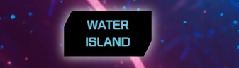
▶ 버튼 만들기
clip-path을 이용하면 성결대 축제사이트에 사용된 버튼을 구현할 수 있다.
 clip-path generator를 검색해서 위와 같은 버튼을 만들어보자
https://10015.io/tools/css-clip-path-generator 사이트를 이용하였다.
clip-path generator를 검색해서 위와 같은 버튼을 만들어보자
https://10015.io/tools/css-clip-path-generator 사이트를 이용하였다.
❗근데 여기서 문제가 생겼다. 버튼이 POOL:US 텍스트 규격에 맞춰서 적용이 되어야하는데 규격을 벗어나버렸다.
수정전 코드는 아래와 같다.
<div class="glitch-wrapper anton-font flex-column">
  <div class="glitch" data-glitch="POOL:US">
    POOL:US
  </div>
  <div class="sub-title issamannu-font text-white my-3">
    2023 영암축전
    <br />
    2023.05.30 - 2023.05.31
  </div>
  <div class="btn-main-waterisland-in text-center issamannu-font py-2">
    WATER ISLAND
  </div>
</div>
수정 후 코드는 아래와 같다. div 태그를 하나 더 추가하여 문제를 해결했다.
<div class="btn-main-waterisland-in text-center issamannu-font py-2">
  WATER ISLAND
</div>
<div>
  <div class="glitch-wrapper anton-font flex-column">
    <div class="glitch" data-glitch="POOL:US">
      POOL:US
    </div>

    <div class="sub-title issamannu-font text-white my-3">
      2023 영암축전
      <br />
      2023.05.30 - 2023.05.31
    </div>
    <div class="btn-main-waterisland-in text-center issamannu-font py-2">
      WATER ISLAND
    </div>
  </div>
</div>
.btn-main-waterisland-in {
  clip-path: polygon(9% 0, 100% 0, 100% 66%, 91% 100%, 0 100%, 0 34%);
  color: #6bc6dd;
  width: 100%;
  height: 100%;
  background-color: #000000;
}
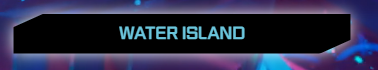
▷ 버튼에 hover와 그림자 부여하기
아래와 같이 버튼에 hover와 그림자를 줘보자
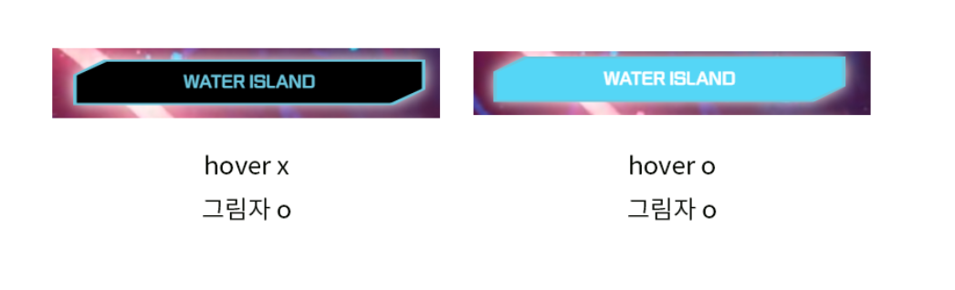 clip-path을 사용하여 div를 깎았으니 버튼을 두개 겹쳐 크기를 다르게 설정하는 방식으로 구현하였다.
❗버튼이 아래와 같이 적용이 되는 문제가 생겼다.
 수정 전 코드는 아래와 같다.
<div>
  <div class="glitch-wrapper anton-font flex-column">
    <div class="glitch" data-glitch="POOL:US">
      POOL:US
    </div>

    <div class="sub-title issamannu-font text-white my-3">
      2023 영암축전
      <br />
      2023.05.30 - 2023.05.31
    </div>
    <a
      href="#"
      class="btn-main d-flex justify-content-center align-items-center"
    >
      <div class="btn-main-waterisland-in text-center issamannu-font py-2">
        WATER ISLAND
      </div>
      <div class="btn-main-waterisland-out text-center issamannu-font py-2"></div>
    </a>
  </div>
</div>
.btn-main {
  position: relative;
  z-index: 1;
  text-decoration-line: none;
  filter: drop-shadow(0px 0px 8px #ffffff);
}
.btn-main-waterisland-in {
  clip-path: polygon(9% 0, 100% 0, 100% 66%, 91% 100%, 0 100%, 0 34%);
  color: #6bc6dd;
  background-color: #000000;
  width: 98%;
  height: 100%;
}
.btn-main-waterisland-out {
  position: absolute;
  clip-path: polygon(9% 0, 100% 0, 100% 66%, 91% 100%, 0 100%, 0 34%);
  color: #6bc6dd;
  width: 100%;
  height: 110%;
  z-index: -1;
}
.btn-main-waterisland-in:hover {
  clip-path: polygon(9% 0, 100% 0, 100% 66%, 91% 100%, 0 100%, 0 34%);
  color: #ffffff;
  background-color: #55d6f6;
  width: 98%;
  height: 100%;
  transition: 0.3s;
}
flex-column로 텍스트와 버튼을 감싸줬기 때문에 WATER ISLAND가 저렇게 출력이 되는 것 같았다.
그래서 flex-column이 적용된 div 태그 위치를 서브텍스트 아래로 변경해주니 해결 완료!
<div>
  <div class="glitch-wrapper anton-font flex-column">
    <div class="glitch" data-glitch="POOL:US">
      POOL:US
    </div>

    <div class="sub-title issamannu-font text-white my-3">
      2023 영암축전
      <br />
      2023.05.30 - 2023.05.31
    </div>
  </div>
  <a href="#" class="btn-main d-flex justify-content-center align-items-center">
    <div class="btn-main-waterisland-in text-center issamannu-font py-2">
      WATER ISLAND
    </div>
    <div class="btn-main-waterisland-out text-center issamannu-font py-2"></div>
  </a>
</div>
그럼 내가 만든 버튼과 성결대 축제사이트 버튼과 비교해보자
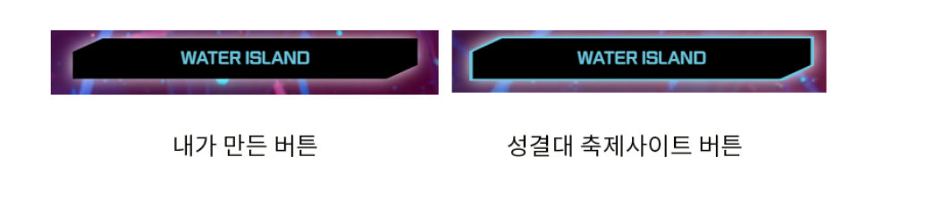 ❗버튼 테두리 부분에 border 속성이 적용되지 않은 문제가 있었다.
근데 이 버튼은 clip-path로 div를 깎은거기 때문에 border 적용이 불가능하다. 그래서 똑같은 버튼 두 개를 만들어 크기를 다르게 설정하여 테두리를 구현한 것이다.
그렇다면 btn-main-waterisland-out 클래스의 크기 설정에 문제가 있지 않을까? 생각했다. 현재 설정된 크기는 다음과 같다.
.btn-main-waterisland-in {
  // 생략
  width: 98%;
  height: 100%;
}

.btn-main-waterisland-out {
  // 생략
  width: 100%;
  height: 110%;
}
.btn-main-waterisland-out 크기를 변경해보자
극단적으로 버튼의 크기를 width: 1020%; height: 1120%; 로변경했더니 아래와 같은 결과가 나왔다.
 이를통해
이를통해 .btn-main-waterisland-out 클래스가 동영상 뒤에 숨겨져 보이지 않는다는 것을 알 수 있었다.
해결해보자. .btn-main-waterisland-in보다는 뒤에 위치해야 할 것이며 .main > video 클래스보다는 앞에 위치해야 할 것이다.
z-index를 수정하여 문제를 해결하면 될 거라고 생각했는데.. z-index를 1보다 높게 설정해주니 hover이 먹히지 않았다. .btn-main의 z-index가 1로 설정되어있어서 그런 것 같다.
정말 어이없는 실수였다… background-color가 아닌 그냥 color를 사용하였으니 텍스트 색상만 변경되므로 당연히 저렇게 보일 수 밖에 없는 것이였다..
.btn-main-waterisland-out 클래스가 동영상 뒤에 숨겨져 안 보이는게 아니였다!!
.btn-main-waterisland-out 클래스는 텍스트가 없기 때문에 위 사진처럼 보인 것이었다.
다음에 안 그러면 된다. 의미없는 삽질이라고 생각하진 않는다🥲
.btn-main-waterisland-out을 background-color로 수정해주었다.
.btn-main-waterisland-out {
  // 생략
  background-color: #6bc6dd;
}
짜잔!
 이제 얼추 비슷해졌다.
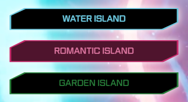
로맨틱 아일랜드와 가든 아일랜드 버튼도 마저 만들어보자
이제 얼추 비슷해졌다.
로맨틱 아일랜드와 가든 아일랜드 버튼도 마저 만들어보자
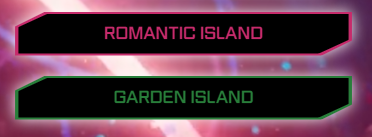
- 로맨틱 아일랜드 - 폰트 컬러 : #c62b6b, 호버 컬러 : #e43a81
- 가든 아일랜드 - 폰트 컬러 : #287e3a, 호버 컬러 : #29a844
워터 아일랜드 버튼을 구현했으니 로맨틱 아일랜드와 가든 아일랜드 버튼 구현하는 건 식은죽먹기! 뭐든 처음 하는 것이 어려운 것 같다.
          <a
            href="#"
            class="btn-main d-flex justify-content-center align-items-center my-3"
          >
            <div
              class="btn-main-waterisland-in text-center issamannu-font py-2"
            >
              WATER ISLAND
            </div>
            <div
              class="btn-main-waterisland-out text-center issamannu-font py-2"
            ></div>
          </a>
          <a
            href="#"
            class="btn-main d-flex justify-content-center align-items-center my-4"
          >
            <div
              class="btn-main-romanticland-in text-center issamannu-font py-2"
            >
              ROMANTIC LSLAND
            </div>
            <div
              class="btn-main-romanticland-out text-center issamannu-font py-2"
            ></div>
          </a>
          <a
            href="#"
            class="btn-main d-flex justify-content-center align-items-center my-4"
          >
            <div class="btn-main-gardenland-in text-center issamannu-font py-2">
              GARDEN ISLAND
            </div>
            <div
              class="btn-main-gardenland-out text-center issamannu-font py-2"
            ></div>
          </a>
.btn-main {
  position: relative;
  z-index: 1;
  text-decoration-line: none;
  filter: drop-shadow(0px 0px 8px #ffffff);
}
.btn-main-waterisland-in {
  clip-path: polygon(9% 0, 100% 0, 100% 66%, 91% 100%, 0 100%, 0 34%);
  color: #6bc6dd;
  background-color: #000000;
  width: 98%;
  height: 100%;
}
.btn-main-waterisland-out {
  position: absolute;
  clip-path: polygon(9% 0, 100% 0, 100% 66%, 91% 100%, 0 100%, 0 34%);
  background-color: #6bc6dd;
  width: 100%;
  height: 110%;
  z-index: -1;
}
.btn-main-waterisland-in:hover {
  clip-path: polygon(9% 0, 100% 0, 100% 66%, 91% 100%, 0 100%, 0 34%);
  color: #ffffff;
  background-color: #55d6f6;
  width: 98%;
  height: 100%;
  transition: 0.3s;
}
.btn-main-romanticland-in {
  clip-path: polygon(9% 0, 100% 0, 100% 66%, 91% 100%, 0 100%, 0 34%);
  color: #c62b6b;
  background-color: #000000;
  width: 98%;
  height: 100%;
}
.btn-main-romanticland-out {
  position: absolute;
  clip-path: polygon(9% 0, 100% 0, 100% 66%, 91% 100%, 0 100%, 0 34%);
  background-color: #c62b6b;
  width: 100%;
  height: 110%;
  z-index: -1;
}
.btn-main-romanticland-in:hover {
  clip-path: polygon(9% 0, 100% 0, 100% 66%, 91% 100%, 0 100%, 0 34%);
  color: #ffffff;
  background-color: #e43a81;
  width: 98%;
  height: 100%;
  transition: 0.3s;
}

.btn-main-gardenland-in {
  clip-path: polygon(9% 0, 100% 0, 100% 66%, 91% 100%, 0 100%, 0 34%);
  color: #287e3a;
  background-color: #000000;
  width: 98%;
  height: 100%;
}
.btn-main-gardenland-out {
  position: absolute;
  clip-path: polygon(9% 0, 100% 0, 100% 66%, 91% 100%, 0 100%, 0 34%);
  background-color: #287e3a;
  width: 100%;
  height: 110%;
  z-index: -1;
}
.btn-main-gardenland-in:hover {
  clip-path: polygon(9% 0, 100% 0, 100% 66%, 91% 100%, 0 100%, 0 34%);
  color: #ffffff;
  background-color: #29a844;
  width: 98%;
  height: 100%;
  transition: 0.3s;
}
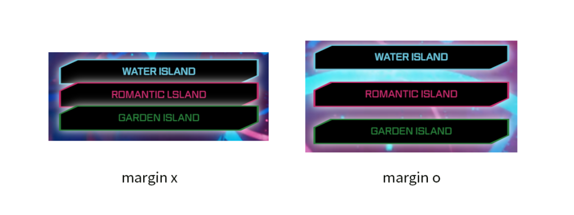
약간의 마진을 주어서 버튼끼리 겹치지 않게 하였다.
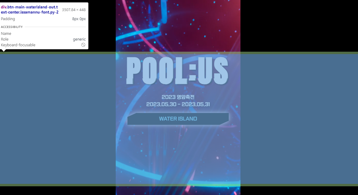
▶ 텍스트 하단 배치하기
미션! 화면과 같이 구현해 보자
- Position을 사용해 섹션 안에서 바닥에 위치 시킬 것
- 텍스트와 이미지에 그림자를 추가할 것
.wayto-water-island
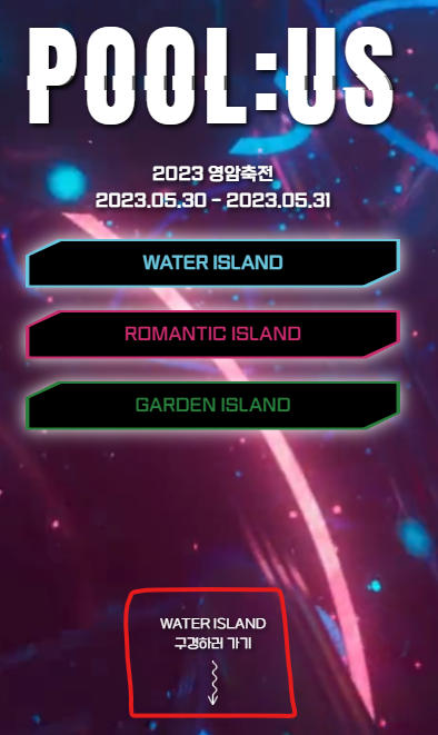
        <div class="wayto-water-island text-center">
          <p>WATER ISLAND <br />구경하러가기</p>
          <img src="./img/arrow.png" alt="way to water island" />
        </div>
.wayto-water-island {
  position: absolute;
  bottom: 0;
  margin-bottom: 35px;
}
.wayto-water-island > p {
  font-size: 12px;
  color: #ffffff;
  margin-bottom: 5px;
  text-shadow: 2px 2px 5px #000000;
}
.wayto-water-island > img {
  width: auto;
  height: 40px;
  filter: drop-shadow(2px 2px 5px #000000);
}
- Position을 사용해 섹션 안에서 바닥에 위치 시킬 것
position: absolute;
bottom: 0;
- 텍스트와 이미지에 그림자를 추가할 것
- 텍스트에 그림자 추가:
text-shadow: 2px 2px 5px #000000; - 이미지에 그림자 추가:
filter: drop-shadow(2px 2px 5px #000000);
1번 미션 수행하면서 느낀건데 position에 대한 이해가 아직 부족한 것 같다. 왜 absolute를 사용했는지 잘 이해가 안갔다.
내가 예전에 작성한 포스팅을 보면 > https://velog.io/@sieunpark/CSS-position
보통 부모는 position : relative로 포지셔닝을 하고, 자식은 position: absolute으로 포지셔닝을 한다. 부모가 포지셔닝이 없을 시, 최상위 body를 기준으로 배치한다.
라고 작성해 놨었다.
즉, 위 코드에서 absolute로 포지션을 잡은 것은 최상위 body를 기준으로 포지셔닝을 하기 위해서라는 것을 알았다!
😳 사실 멋사 대표님한테 왜 absolute를 사용했는지 물어봤었는데 금세 까먹어버렸다 최상위 body를 기준으로 배치하려면 absolute로 포지션을 잡는다는걸 꼭 기억해야지!
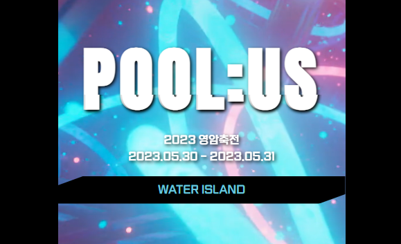
▶ 완성!
짜잔!
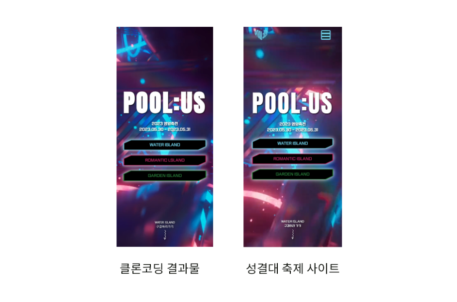
살짝 POOL:US 부분이 다르게 보이는데 폰트 굵기를 다르게 설정해줘서 그런 것 같다.
폰트 굵기를 ` font-weigh: 300;`으로 설정해줘서 얇게 바꿀 수 있을 것 같은데 변경이 안된다. 선배한테 물어봐야겠다! 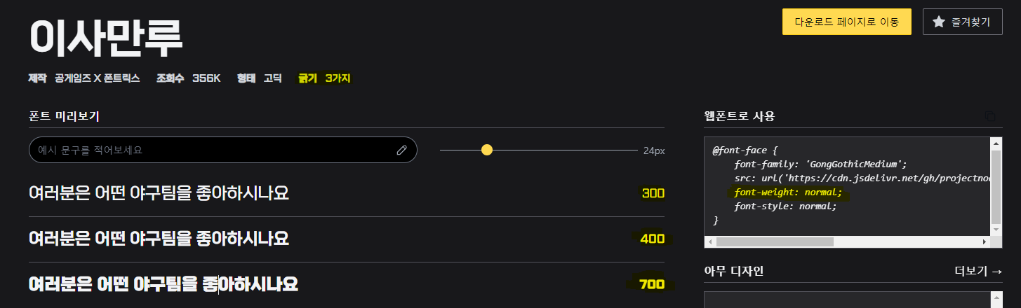
▷ 전체 코드
html
<!DOCTYPE html>
<html lang="ko">
  <head>
    <meta charset="UTF-8" />
    <meta name="viewport" content="width=device-width, initial-scale=1.0" />
    <link
      href="https://cdn.jsdelivr.net/npm/bootstrap@5.3.0/dist/css/bootstrap.min.css"
      rel="stylesheet"
      integrity="sha384-9ndCyUaIbzAi2FUVXJi0CjmCapSmO7SnpJef0486qhLnuZ2cdeRhO02iuK6FUUVM"
      crossorigin="anonymous"
    />
    <link rel="stylesheet" href="style.css" />
    <title>POOL:US</title>
  </head>
  <body>
    <div class="display-container">
      <div class="main d-flex justify-content-center align-items-center">
        <video autoplay loop muted playsinline>
          <source
            src="./video/circles_-_52962 (Original).asc"
            type="video/mp4"
          />
        </video>

        <div>
          <div class="glitch-wrapper anton-font flex-column">
            <div class="glitch" data-glitch="POOL:US">POOL:US</div>

            <div class="sub-title issamannu-font text-white my-3">
              2023 영암축전<br />2023.05.30 - 2023.05.31
            </div>
          </div>
          <a
            href="#"
            class="btn-main d-flex justify-content-center align-items-center my-3"
          >
            <div
              class="btn-main-waterisland-in text-center issamannu-font py-2"
            >
              WATER ISLAND
            </div>
            <div
              class="btn-main-waterisland-out text-center issamannu-font py-2"
            ></div>
          </a>
          <a
            href="#"
            class="btn-main d-flex justify-content-center align-items-center my-4"
          >
            <div
              class="btn-main-romanticland-in text-center issamannu-font py-2"
            >
              ROMANTIC LSLAND
            </div>
            <div
              class="btn-main-romanticland-out text-center issamannu-font py-2"
            ></div>
          </a>
          <a
            href="#"
            class="btn-main d-flex justify-content-center align-items-center my-4"
          >
            <div class="btn-main-gardenland-in text-center issamannu-font py-2">
              GARDEN ISLAND
            </div>
            <div
              class="btn-main-gardenland-out text-center issamannu-font py-2"
            ></div>
          </a>
        </div>
        <div class="wayto-water-island text-center">
          <p>WATER ISLAND <br />구경하러가기</p>
          <img src="./img/arrow.png" alt="way to water island" />
        </div>
      </div>
    </div>

    <script
      src="https://cdn.jsdelivr.net/npm/bootstrap@5.3.0/dist/js/bootstrap.bundle.min.js"
      integrity="sha384-geWF76RCwLtnZ8qwWowPQNguL3RmwHVBC9FhGdlKrxdiJJigb/j/68SIy3Te4Bkz"
      crossorigin="anonymous"
    ></script>
  </body>
</html>
css
@import url("https://fonts.googleapis.com/css2?family=Anton&display=swap");
@font-face {
  font-family: "GongGothicMedium";
  src: url("https://cdn.jsdelivr.net/gh/projectnoonnu/noonfonts_20-10@1.0/GongGothicMedium.woff")
    format("woff");
  font-weight: normal;
  font-style: normal;
}
.anton-font {
  font-family: "Anton", sans-serif;
}
.issamannu-font {
  font-family: "GongGothicMedium";
}
body {
  background-color: #000000;
}
.display-container {
  max-width: 415px;
  min-height: 100vh;
  margin-left: auto;
  margin-right: auto;
}
.main {
  position: relative;
  min-height: 100vh;
}
.main > video {
  position: absolute;
  width: 100%;
  height: 100%;
  top: 0;
  left: 0;
  object-fit: cover;
  z-index: -1;
}
.sub-title {
  text-shadow: 2px 2px 5px black;
}
.btn-main {
  position: relative;
  z-index: 1;
  text-decoration-line: none;
  filter: drop-shadow(0px 0px 8px #ffffff);
}
.btn-main-waterisland-in {
  clip-path: polygon(9% 0, 100% 0, 100% 66%, 91% 100%, 0 100%, 0 34%);
  color: #6bc6dd;
  background-color: #000000;
  width: 98%;
  height: 100%;
}
.btn-main-waterisland-out {
  position: absolute;
  clip-path: polygon(9% 0, 100% 0, 100% 66%, 91% 100%, 0 100%, 0 34%);
  background-color: #6bc6dd;
  width: 100%;
  height: 110%;
  z-index: -1;
}
.btn-main-waterisland-in:hover {
  clip-path: polygon(9% 0, 100% 0, 100% 66%, 91% 100%, 0 100%, 0 34%);
  color: #ffffff;
  background-color: #55d6f6;
  width: 98%;
  height: 100%;
  transition: 0.3s;
}
.btn-main-romanticland-in {
  clip-path: polygon(9% 0, 100% 0, 100% 66%, 91% 100%, 0 100%, 0 34%);
  color: #c62b6b;
  background-color: #000000;
  width: 98%;
  height: 100%;
}
.btn-main-romanticland-out {
  position: absolute;
  clip-path: polygon(9% 0, 100% 0, 100% 66%, 91% 100%, 0 100%, 0 34%);
  background-color: #c62b6b;
  width: 100%;
  height: 110%;
  z-index: -1;
}
.btn-main-romanticland-in:hover {
  clip-path: polygon(9% 0, 100% 0, 100% 66%, 91% 100%, 0 100%, 0 34%);
  color: #ffffff;
  background-color: #e43a81;
  width: 98%;
  height: 100%;
  transition: 0.3s;
}

.btn-main-gardenland-in {
  clip-path: polygon(9% 0, 100% 0, 100% 66%, 91% 100%, 0 100%, 0 34%);
  color: #287e3a;
  background-color: #000000;
  width: 98%;
  height: 100%;
}
.btn-main-gardenland-out {
  position: absolute;
  clip-path: polygon(9% 0, 100% 0, 100% 66%, 91% 100%, 0 100%, 0 34%);
  background-color: #287e3a;
  width: 100%;
  height: 110%;
  z-index: -1;
}
.btn-main-gardenland-in:hover {
  clip-path: polygon(9% 0, 100% 0, 100% 66%, 91% 100%, 0 100%, 0 34%);
  color: #ffffff;
  background-color: #29a844;
  width: 98%;
  height: 100%;
  transition: 0.3s;
}
.wayto-water-island {
  position: absolute;
  bottom: 0;
  margin-bottom: 35px;
}
.wayto-water-island > p {
  font-size: 12px;
  color: #ffffff;
  margin-bottom: 5px;
  text-shadow: 2px 2px 5px #000000;
}
.wayto-water-island > img {
  width: auto;
  height: 40px;
  filter: drop-shadow(2px 2px 5px #000000);
}

.glitch-wrapper {
  width: 100%;
  height: 100%;
  display: flex;
  align-items: center;
  justify-content: center;
  text-align: center;
  background-color: rgba(33, 33, 33, 0);
  text-shadow: 2px 2px 5px black;
}

.glitch {
  position: relative;
  font-size: 100px;
  font-weight: 700;
  line-height: 1.2;
  color: #fff;
  letter-spacing: 6px;
  z-index: 1;
}

.glitch:before {
  content: attr(data-glitch);
  position: absolute;
  top: 0;
  left: -2px;
  width: 100%;
  color: #fff;
  background-color: rgba(33, 33, 33, 0);
  overflow: hidden;
  clip: rect(0, 900px, 0, 0);
  animation: noise-before 3s infinite linear alternate-reverse;
}

.glitch:after {
  content: attr(data-glitch);
  position: absolute;
  top: 0;
  left: 2px;
  width: 100%;
  color: #fff;
  background-color: rgba(33, 33, 33, 0);
  overflow: hidden;
  clip: rect(0, 900px, 0, 0);
  animation: noise-after 2s infinite linear alternate-reverse;
}

@keyframes noise-before {
  0% {
    clip: rect(61px, 9999px, 52px, 0);
  }

  5% {
    clip: rect(33px, 9999px, 144px, 0);
  }

  10% {
    clip: rect(121px, 9999px, 115px, 0);
  }

  15% {
    clip: rect(144px, 9999px, 162px, 0);
  }

  20% {
    clip: rect(62px, 9999px, 180px, 0);
  }

  25% {
    clip: rect(34px, 9999px, 42px, 0);
  }

  30% {
    clip: rect(147px, 9999px, 179px, 0);
  }

  35% {
    clip: rect(99px, 9999px, 63px, 0);
  }

  40% {
    clip: rect(188px, 9999px, 122px, 0);
  }

  45% {
    clip: rect(154px, 9999px, 14px, 0);
  }

  50% {
    clip: rect(63px, 9999px, 37px, 0);
  }

  55% {
    clip: rect(161px, 9999px, 147px, 0);
  }

  60% {
    clip: rect(109px, 9999px, 175px, 0);
  }

  65% {
    clip: rect(157px, 9999px, 88px, 0);
  }

  70% {
    clip: rect(173px, 9999px, 131px, 0);
  }

  75% {
    clip: rect(62px, 9999px, 70px, 0);
  }

  80% {
    clip: rect(24px, 9999px, 153px, 0);
  }

  85% {
    clip: rect(138px, 9999px, 40px, 0);
  }

  90% {
    clip: rect(79px, 9999px, 136px, 0);
  }

  95% {
    clip: rect(25px, 9999px, 34px, 0);
  }

  100% {
    clip: rect(173px, 9999px, 166px, 0);
  }
}

@keyframes noise-after {
  0% {
    clip: rect(26px, 9999px, 33px, 0);
  }

  5% {
    clip: rect(140px, 9999px, 198px, 0);
  }

  10% {
    clip: rect(184px, 9999px, 89px, 0);
  }

  15% {
    clip: rect(121px, 9999px, 6px, 0);
  }

  20% {
    clip: rect(181px, 9999px, 99px, 0);
  }

  25% {
    clip: rect(154px, 9999px, 133px, 0);
  }

  30% {
    clip: rect(134px, 9999px, 169px, 0);
  }

  35% {
    clip: rect(26px, 9999px, 187px, 0);
  }

  40% {
    clip: rect(147px, 9999px, 137px, 0);
  }

  45% {
    clip: rect(31px, 9999px, 52px, 0);
  }

  50% {
    clip: rect(191px, 9999px, 109px, 0);
  }

  55% {
    clip: rect(74px, 9999px, 54px, 0);
  }

  60% {
    clip: rect(145px, 9999px, 75px, 0);
  }

  65% {
    clip: rect(153px, 9999px, 198px, 0);
  }

  70% {
    clip: rect(99px, 9999px, 136px, 0);
  }

  75% {
    clip: rect(118px, 9999px, 192px, 0);
  }

  80% {
    clip: rect(1px, 9999px, 83px, 0);
  }

  85% {
    clip: rect(145px, 9999px, 98px, 0);
  }

  90% {
    clip: rect(121px, 9999px, 154px, 0);
  }

  95% {
    clip: rect(156px, 9999px, 44px, 0);
  }

  100% {
    clip: rect(67px, 9999px, 122px, 0);
  }
}
댓글남기기