
[Next.js] SCSS + Tailwind CSS + Shadcn ui를 활용한 웹 퍼블리싱
1. SCSS + Tailwind CSS + Shadcn UI 조합의 시너지
- SCSS로 컴포넌트의 전체적인 레이아웃과 구조적인 스타일을 잡고, 그 위에 Tailwind CSS로 더 세부적인 스타일링을 추가한다.
- Shadcn UI는 일관된 UI 컴포넌트를 제공하여 기본적인 UI 요소를 빠르게 구현하고, Tailwind CSS로 세부 스타일을 추가하여 원하는 형태로 조정할 수 있다.
2. SCSS: 구조적이고 모듈화된 스타일링
2.1 SCSS 예시
SCSS는 컴포넌트의 전체적인 구조와 레이아웃을 설정하는 데 유용하다.
복잡한 스타일링이 필요한 레이아웃을 정의할 때 SCSS의 중첩과 변수 기능을 활용할 수 있다.
// app/page.tsx
import { Button } from "@/components/ui/button";
import styles from "./page.module.scss";

const HomePage = () => {
  return (
    <div className={styles.container}>
      <div className={styles.container__onBoarding}>
        <span className={styles.container__onBoarding__title}>
          How to Start
        </span>
        <div className={styles.container__onBoarding__steps}>
          <span>1. Create a page</span>
          <span>2. Add boards to page</span>
        </div>
        {/* 페이지 추가버튼 */}
        ...
      </div>
    </div>
  );
};

export default HomePage;
// app/page.module.scss
.container {
  display: flex;
  align-items: center;
  justify-content: center;

  width: 920px;
  height: 100vh;
  background-color: #f9f9f9;
  border-right: 1px solid #d6d6d6;

  &__onBoarding {
    display: flex;
    flex-direction: column;
    align-items: center;
    justify-content: center;

    width: 200px;

    gap: 20px;

    &__title {
      font-size: 28px;
      font-weight: 700;

      color: #454545;
    }

    &__steps {
      display: flex;
      flex-direction: column;
      align-items: center;
      justify-content: center;

      gap: 8px;

      font-size: 18px;
      color: #454545;
    }
  }
}
위 예시에서, SCSS는 페이지 구조와 레이아웃을 담당하며, 각 컴포넌트의 스타일을 계층적으로 관리할 수 있게 돕는다.
2.2 module.scss와 scss
CSS Modules (module.scss)
- CSS Modules는 컴포넌트 기반의 스타일링을 할 때 유용하다.
- 클래스 이름이 로컬 스코프(scope)로 제한되기 때문에, 스타일 충돌을 방지할 수 있다.
일반 SCSS (.scss) 사용
- 일반 SCSS 파일을 사용하면, 모든 클래스가 전역적으로 적용되기 때문에 스타일 충돌이 발생할 수 있다.
- 일반적으로 전역 스타일이 필요할 때는
.scss파일을 사용한다.
2.3 명명 규칙
페이지 파일에 대한 네이밍
-
페이지 스타일 파일은
page.module.scss와 같은 방식으로 관리한다. -
e.g.,
app/create/page.tsx에 해당하는 스타일 파일app/page.module.scss
컴포넌트 파일에 대한 네이밍
-
컴포넌트 스타일은 해당 컴포넌트에 국한된 스타일을 정의한다.
-
SideNavigation.module.scss와 같은 방식으로 사용한다. -
e.g.,
components/common/navigation/SideNavigation.tsx에 해당하는 스타일 파일components/common/navigation/SideNavigation.module.scss
3. Tailwind CSS와 Shadcn UI의 활용
3.1 Tailwind CSS와 Shadcn UI 예시
Shadcn UI는 미리 디자인된 UI 컴포넌트를 제공하여 UI 요소를 빠르게 구성하고, 일관된 디자인을 유지할 수 있도록 돕는다.
공식 문서↗️를 참고하여 설치 및 사용하면 된다.
사용하고 싶은 컴포넌트를 설치하고 import 하여 사용하면 된다.
import { Button } from "@/components/ui/button"; // Shadcn UI의 버튼

// 페이지 추가 버튼
<Button
  variant="outline"
  size="icon"
  className="w-full bg-transparent text-orange-500 border-orange-400 hover:bg-orange-50 hover:text-orange-500"
>
  <Search />
</Button>;
위에서 Tailwind CSS의 유틸리티 클래스를 사용해 Shadcn UI에 스타일을 추가하였다.
3.2 커스텀하기
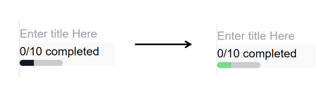
아래와 같이프로그래스 바의 색상을 변경하고 싶은 상황
기존 코드
// components/ui/progress.tsx
"use client";

import * as React from "react";
import * as ProgressPrimitive from "@radix-ui/react-progress";

import { cn } from "@/lib/utils";

const Progress = React.forwardRef<
  React.ElementRef<typeof ProgressPrimitive.Root>,
  React.ComponentPropsWithoutRef<typeof ProgressPrimitive.Root>
>(({ className, value, ...props }, ref) => (
  <ProgressPrimitive.Root
    ref={ref}
    className={cn(
      "relative h-2 w-full overflow-hidden rounded-full bg-primary/20",
      className
    )}
    {...props}
  >
    <ProgressPrimitive.Indicator
      className="h-full w-full flex-1 bg-primary transition-all"
      style={{ transform: `translateX(-${100 - (value || 0)}%)` }}
    />
  </ProgressPrimitive.Root>
));
Progress.displayName = ProgressPrimitive.Root.displayName;

export { Progress };
변경한 코드
indicatorColor를 props로 추가하기 (클래스 이름은 indicatorColor가 아니야도 된다.)
// components/ui/progress.tsx
"use client";

import * as React from "react";
import * as ProgressPrimitive from "@radix-ui/react-progress";

import { cn } from "@/lib/utils";

interface CustomProgressProps
  extends React.ComponentPropsWithRef<typeof ProgressPrimitive.Root> {
  indicatorColor: string;
}

const Progress = React.forwardRef<
  React.ElementRef<typeof ProgressPrimitive.Root>,
  CustomProgressProps
>(({ className, value, indicatorColor, ...props }, ref) => (
  <ProgressPrimitive.Root
    ref={ref}
    className={cn(
      "relative h-2 w-full overflow-hidden rounded-full bg-primary/20",
      className
    )}
    {...props}
  >
    <ProgressPrimitive.Indicator
      className={`h-full w-full flex-1 bg-primary transition-all ${indicatorColor}`}
      style={{ transform: `translateX(-${100 - (value || 0)}%)` }}
    />
  </ProgressPrimitive.Root>
));
Progress.displayName = ProgressPrimitive.Root.displayName;

export { Progress };
이제 아래와 같이 사용하면 프로그래스 바의 색상이 변경된다.
<Progress value={33} className="w-[30%]" indicatorColor="bg-green-400" />
3.3 lucide-react 아이콘 라이브러리 사용하기
default 로 설치한 경우
lucide-react라는 아이콘 라이브러리를 사용할 수 있다.
lucide-react는 아이콘을 쉽게 사용할 수 있도록 돕는 라이브러이다.
Shadcn UI에서는 여러 컴포넌트들에 아이콘을 포함할 때 이 라이브러리를 사용한다.
Lucide Icons Official↗️를 통해 Lucide 아이콘의 전체 아이콘을 볼 수 있다.
import { Search } from "lucide-react"; // 아이콘을 가져옴
import { Button } from "@shadcn/ui"; // Shadcn UI의 버튼

// 페이지 추가 버튼
<Button
  variant="outline"
  size="icon"
  className="w-full bg-transparent text-orange-500 border-orange-400 hover:bg-orange-50 hover:text-orange-500"
>
  <Search size={16} />
</Button>;
4. 결론
SCSS, Tailwind CSS, Shadcn UI를 조합하여 웹 퍼블리싱을 할 때, 각 기술의 장점을 최대한 활용할 수 있다.
- SCSS로 레이아웃과 구조를 잡고, Tailwind CSS로 빠르게 세부 스타일을 추가할 수 있다.
- Shadcn UI로 미리 디자인된 UI 컴포넌트를 사용해 일관된 디자인을 유지할 수 있다.
- Lucide 아이콘을 활용하여 쉽게 아이콘을 추가할 수 있다.
댓글남기기